This is a collection of notes on my multi-year journey of migrating from deep in the Google ecosystem to deep in the Apple ecosystem.
- Why?
- Broad Themes
- Specific Notes
- Key
- ✔ ArchLinux → macOS
- ✔ Nexus 7 → iPad
- ✔ Pixel → iPhone
- ✔ Moto 360 → Apple Watch
- ✔ Chromecast/Google TV → Apple TV
- ✔ Google Home → Apple Home
- ✔ Pixel Buds → AirPods Pro
- ⚠ Gmail → iCloud Mail
- ⚠ Google Calendar → Apple Calendar
- ⚠ Google Maps → Apple Maps
- ✔ Google Photos → Apple Photos
- ⚠ Chrome → Safari
- ✔ Google Sheets → Numbers
- ✔ Keep → Apple Notes
- ✔ Tasks → Reminders
- ⅹ Google Assistant → Siri
- ✔ Google Assistant Routines → Shortcuts
- ⚠ Google Drive → iCloud Drive
- ⅹ YouTube Music → Apple Music
- ✔ Google Pay → Apple Pay
- ✔ Google Podcasts → Apple Podcasts
- Conclusion
Why?
My life is in Google more than anyone I know. The usual suspects sure—Gmail, Photos, Chrome, etc.—but also the ones people stay away from—Tasks, Keep, YouTube Music, Fit, Pay, Play Books, Play Movies & TV, Podcasts, etc. We have more Google Homes than rooms. I was a beta user for the first Chromebook, the Cr-48. I have more scar tissue than most from services being sent to the “Google graveyard”. And for a few years, I overlaid my Facebook profile picture with a Google+ logo and the text “I’ve moved”. Of course, it's no surprise I’ve been an Android user for 12 years, 10 of them on Nexus and Pixel devices.
But once in a while I like to challenge my beliefs by changing seats. This is how I understand why—or whether—I prefer what I chose. For Android, that means trialing an iPhone. I did this five years ago for a few months (thanks bensw), but afterwards I thought "It's actually not that different, it's just that the Google apps don't feel native, so I’ll stick with Android".
Since then, I've realized it’s hard to know the Apple value proposition without being immersed in the Apple ecosystem. For the same reason Google apps don’t shine on iOS, iOS doesn't shine if you only use Google apps.
So after a buggy summer with my Pixel 3a, I decided to give Apple an honest, holistic, multi-year shot. Its walled garden may not let me out, but better to trap myself on one side and know both, than trap myself on the other and know one. These are my notes on hopping the fence.
Broad Themes
Before I dump my notes about specific transition experiences, I'll summarize the themes I've witnessed during them.
Safety vs. Freedom
In 2020 I tried to release a Flutter app on iOS. I'd long ago published its Android build, but the iOS approval process was yielding denial after denial. I was frustrated, but I was also a new iOS user, and I could see with fresh eyes the effects of the strictness.
Compared with Android, iOS apps feel like part of the operating system. They don't feel like they were written by others, and that makes me feel safe. My data feels like part of my device, not part of Google. And I trust my device to manage my payment, location, etc. data, because it is mine. I own it.
That feeling is not strong enough that people will voice it, or fight for it. But it's a good feeling. And it only comes with control—control by a representative I trust, over parties I don't. I don't know app developers, especially small ones. But I know Apple. Through them I can trust app developers, but only because Apple so heavily controls what they can publish. They can't send me to their sketchy site or use dark patterns to trick me into paying them.
Some would say more choice is always better; that if I don't feel safe, I have the choice not to do the sketchy thing. I disagree. I have "the choice" to do a food safety inspection of every restaurant I visit, but I do not want to and I wouldn't know what I'm looking for, so I trust my local health department. This allows me to visit any restaurant stress-free, without food safety taking up space in my brain.
For example, all purchases that enable new app functionality must go through the Apple in-app purchase flow. As a developer, this means Apple takes a cut of everything. As a user, this means one central place where I can manage (read: cancel) subscriptions—no digging through menus or talking to customer service agents.
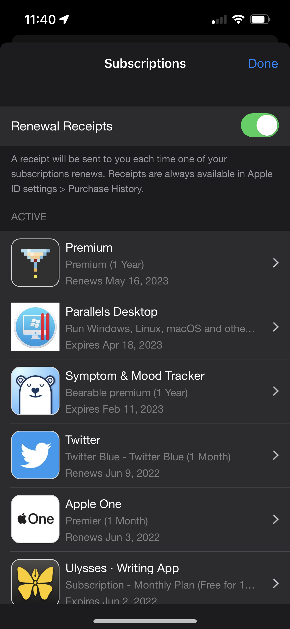
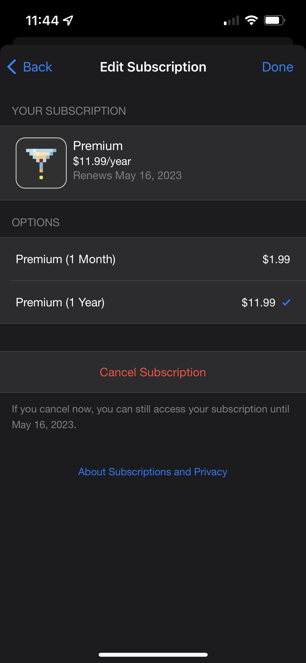
The App Store's subscriptions management menus.
Another example: If your app allows signing in with any third party auth providers, Apple must be one of them. As a developer, this means building another sign-in flow and database table. As a user, this means I get a native, one-tap, FaceID sign-in.
These examples continue throughout the ecosystem, and the more I see the more I believe Apple thinks of itself as a government providing "public goods", whereas Google optimizes for what increases ad clickthrough—data, eyeballs, and engagement. Of course, this has its problems. Apple is a private company, not elected officials, so is only as beholden to its end users as it wants to be. For now, the incentives seem aligned.
Offline-first vs. Online-first Design
Having multiple macOS and iOS devices made clear the differences in attitude Google and Apple have toward user data, and by extension user identity. To Google, a user is a Google account first; a device is just a window into that account. The device may have some caching and synchronization to remain useful offline, but ultimately Google's servers are the source of truth.
To Apple, a user is a device first. iCloud exists to synchronize data between multiple devices, but it's just that—synchronization. Apps usually wait until the device is plugged in to bother syncing, and you can even still perform a first-class OS-level sync of all your data to another device with a cable instead of iCloud. You can also opt to keep everything local.
Here are some ways these differences are expressed:
- Google wants a blurry line between web and native experiences; its official apps are going the way of PWAs and similar tech that can be deployed to web and app ~identically. In contrast Apple puts every major UX flow in a native app, from email and calendar to bug reporting and account management. Even uploading apps to the App Store for publishing—a fundamentally online experience—is a native macOS app.
- Google Docs documents are rows in a database. Apple Pages documents are files on a filesystem.
- When you message someone with iMessage you are messaging a device (a phone number or email), not an Apple account—even if the bubble is blue. You may even be unknowingly using a combination of phone and email for one contact, because iMessage silently interleaves them if they're owned by the same Apple account. If that person later removes one from their Apple account, your iMessage thread with them retroactively splits.
- In the Google ecosystem, when you take or make a Fi / Voice call from your computer, you're going through Google's servers. In the Apple ecosystem, when you take or make a call from your Mac or iPad, you're connecting locally to your iPhone to route the call.
Part of this local-first approach is charming compared to a monolithic always-online Google account, but it’s not for everyone. I regularly experience synchronization delays and conflicts. Sync settings for a machine are centralized in iCloud settings where they're often off by default. I still can't get one of my Safaris to synchronize its bookmarks with the rest.
Commitment vs. Experimentation
Google is infamous for killing products. They release early, often, and in isolation; see Hangouts and Allo, Meet and Duo, or Reminders and Tasks. Innovation comes first and stablizing the product offering comes second, when the product is proven (or not proven) to work.
Apple instead takes the "measure twice, cut once" approach; products are rarely released and rarely killed. The iPod was around for 21 years, co-existing with the iPhone for 12 of them. Apple Maps was a notoriously failed app at launch in 2012 and still suffers from that reputational injury, however it's still around anyway and has improved drastically (although whether enough is still in question).
Google's reputation for killing products causes a negative feedback loop. When Google releases a product that relies on market buy-in—say, a watch OS (needs app developer buy-in) or a chat app (needs consumer buy-in)—it's an uphill battle to get the market on board, because it knows Google may turn around and kill the product anyway. This lack of buy-in seals the product's fate, and it goes to the graveyard.
In contrast, Apple's reputation for not killing products causes the market to embrace it with open arms, kicking off a positive feedback loop that ensures its success. iPad needed developers to design for a different form factor to be successful, and they did. Apple Watch needed developers to design watch flows for their app to be successful, and they did.
There are more factors at play than reputation, like developer experience and user experience, but the point stands—a reputation for killing products contributes to more product deaths.
Specific Notes
Below are my notes on moving between the ecosystems at specific touchpoints. To see an overview, visit the table of contents.
Key
- ✔ Switch successful; happily using Apple product
- ⅹ Switch unsuccessful; moved back to Google or to another product
- ⚠ Nuanced
✔ ArchLinux → macOS
I have used one or another Mac as a development machine for nearly a decade, so this is the only swap not done as part of my mass migration. I grew up gaming on Windows and moved to Linux for development due to a love of the POSIX command line and the simplicity of the system. I found macOS to scratch the same itches without the days spent customizing and debugging things.
Homebrew is as mature as any package manager, similar in ease-of-use to
apt[-get] but with on average more up-to-date packages and, including taps, a
breadth of packages rivaling even (dare I say it) the AUR. It also bundles its
own service management, e.g.
brew services start postgresql.
TouchID is a good middle ground for administrative access between Windows security (click yes) and Linux (type your password). It's good enough that it stops me from using clamshell mode more, knowing I'll have to type my password to unlock 1Password here and there.
The app ethos on macOS is that all apps are self-contained .app files, and
uninstalling an app is defined as rming that file. It's spoiled me to
hesitation when I encounter the rare app that needs an installer.
Roughly half the apps I use are available on the macOS App Store. For apps it manages, it handles updates, payments, and even prompts for review. I generally look there first when searching for an app, then Homebrew (if I know what I'm looking for), then Google.
✔ Nexus 7 → iPad
My minimum goal for a tablet is to replace all at-home phone use; it should give a strictly upgraded experience. As a habit, I carry it room-to-room.
When I used the Nexus 7 as my home tablet, apps didn’t expect one user to be using two devices, so desync bugs were frequent. Almost zero apps used the tablet form factor well or at all, so the UX was usually worse than using the same app on my phone. I expected a more polished but overall similar experience from iPad.
Instead, it’s fulfilled the minimum goal and has even replaced some light computer use. The app ecosystem understands and embraces the form factor; apps use it to display more and differently laid out information. Generally, the extra horizontal space is used to persistently display a nav menu or the previous screen.
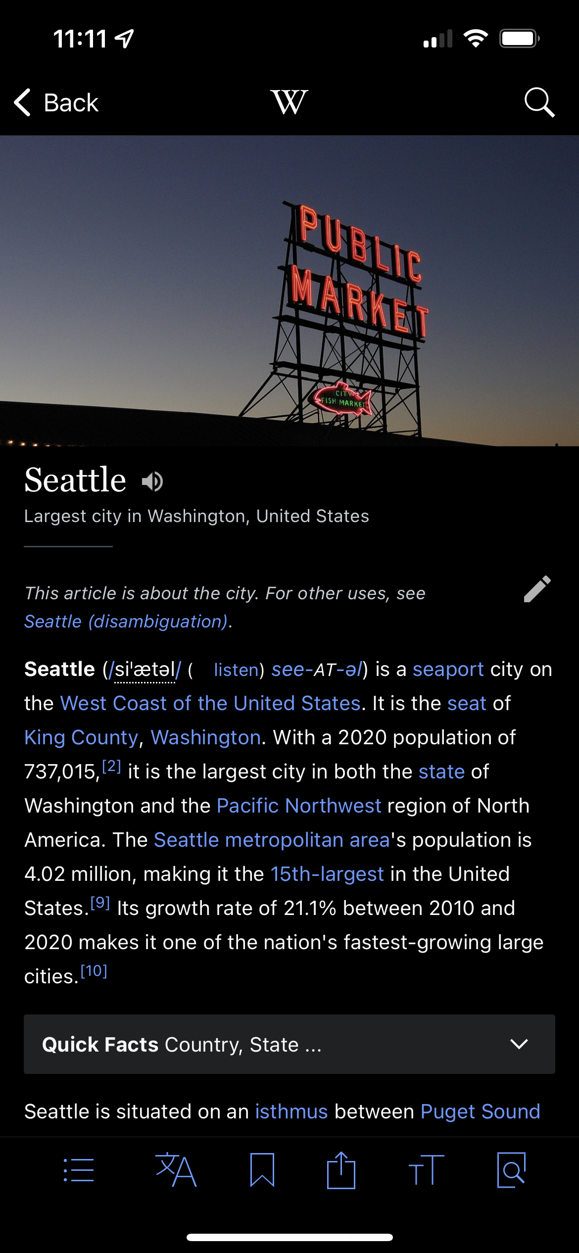
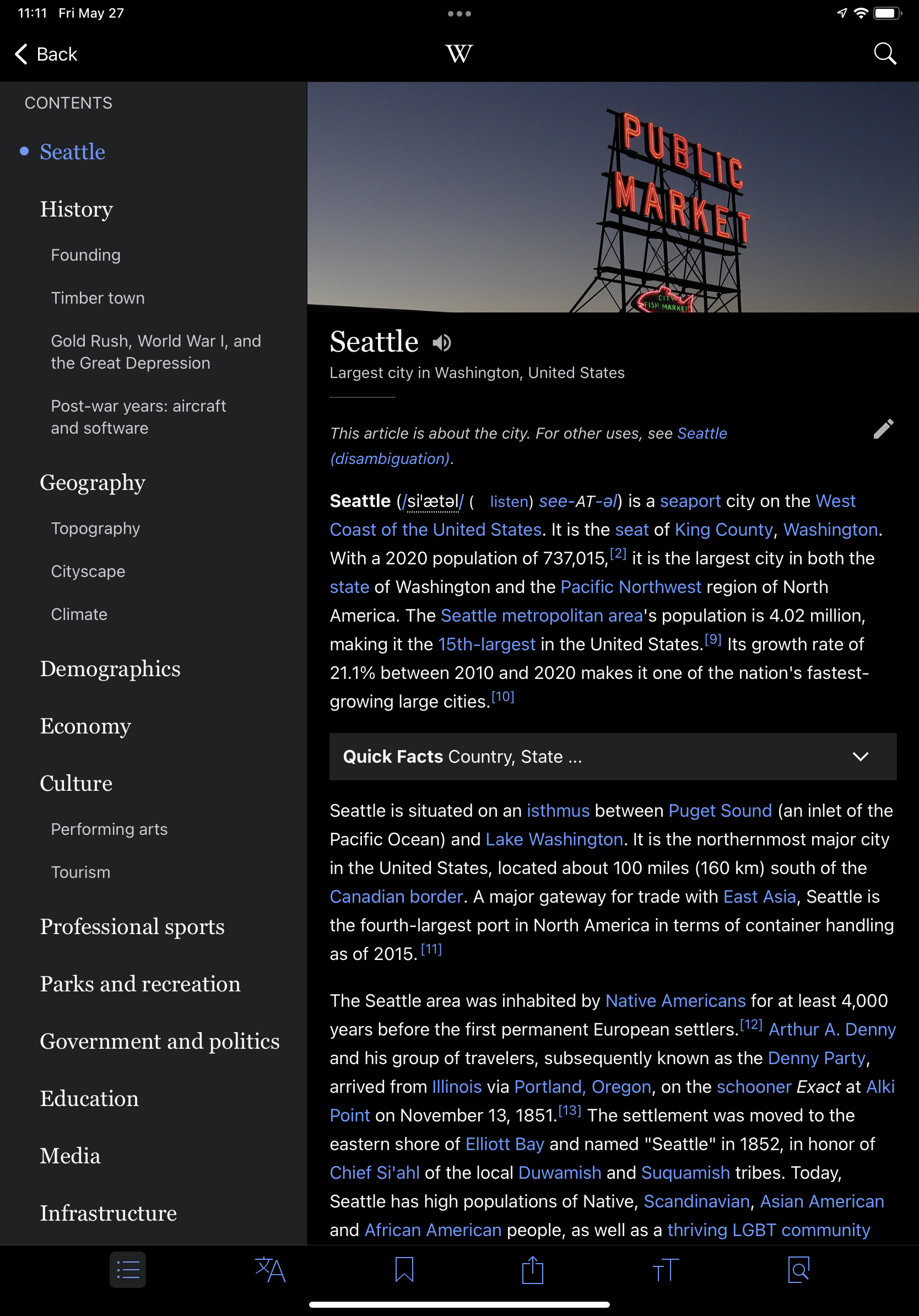
Wikipedia on iPhone vs. iPad.
A bit ago, Apple rebranded iOS-on-iPad to iPadOS. At the time I saw this as a marketing move, but I've learned they really did push the needle more in the direction of general-purpose computing. The three features that did it for me are:
- Multiple windows for one app
- Files app
- Better multitasking
Only a handful of apps support multiple windows at this time, but being able to e.g. view one email in a thread while composing a reply feels great.
Apple also takes a strong stance on whether a feature will be available on both platforms. For example, iPad does not allow swipe-typing; iPad can show multiple apps on the screen at a time, but iPhone cannot; and iPad has no Wallet or Apple Pay. I felt confused about these inconsistencies at first, but I see Apple’s angle— none of them quite make sense on the other form factor. Apple would rather withhold the feature than allow using it to be confusing or unintuitive. Infamously, there is no calculator app for iPad because Apple hasn’t found the time to adapt the iPhone calculator design.
Ecosystem effects of iPad are the ability to use it as a second monitor, and the ability to use a Mac’s mouse and keyboard to control it. macOS’s Preview app allows iPad to be used as an input device for signing documents and marking up images. This is something I did before by manually transferring files, but now it’s two clicks with instant sync.
✔ Pixel → iPhone
As I said earlier, iOS shines when you use native apps. Apple apps especially, but also any (rare) third party app that takes the care to support all the small UX goodies. The more native apps, the better the UX.
For example, multi-touch can be used to drag-and-drop items between apps.
Using multi-touch to drag and drop items between apps.
FaceID is about on par with fingerprint unlock on Pixel. They each encounter their own troubles, but both are great overall and I'm no more or less happy.
Google Fi
When I switched to iPhone, we had been using Google Fi as our carrier. We decided to stay with it because they'd recently started to officially support iPhone. However, after about a year we found out that Google Fi had been intermittently dropping outgoing SMS messages from iPhones, leading one friend (I hope only one) and I to think we were ghosting each other. Once I learned this, Summer and I immediately switched off Google Fi to T-Mobile, which had a close ethical alignment around contracts and data usage.
Even if this whole Apple experiment fails and I go back to Android, I can't see myself trusting Fi again after such an impactful and long-term bug that was never even communicated.
Notifications
Notifications on iOS behave differently than on Android, and that difference makes them feel worse at first. After some time I’d call them a sidegrade.
Android notifications are stateful. If you receive a Gmail notification on your phone then read that email on any platform, the notification goes away. Otherwise, the notification will be there even days later. In this way, Android notifications can be used as a todo list of sorts.
iOS notifications are a feed. In the same scenario on iOS, the notification is (usually) never revoked remotely. Instead, when the phone is unlocked the notification moves to a secondary location “below” (via swipe) the lockscreen. I do inbox zero, so this is strictly worse. I forget to address notifications by committing the cardinal sin of unlocking my phone.
However, iOS mostly fills the gap with badges. Badges are red numbers in the corners of app icons that are stateful in the same way Android notifications are, so can be used as a todo list. They're a decent enough substitute that although I still prefer Android’s notifications, the difference is a couple of orders of magnitude less impactful than I scoped it out as. iOS doesn't have Android's support for natively granular notification muting, so this separation is sometimes useful to not completely black hole a misbehaving app.
iMessage
I finally know why none of my iPhone friends were as excited as me about “solving” mobile chat—it’s been solved for them for years. iMessage is the gold standard of chat apps. I’m even feeling the guilty urge to nudge friends towards iPhone so I can use it with them.
Like I mentioned re: Apple's device-first philosophy, to users iMessage threads appear to be between contacts, but behind the scenes they're between contact methods like phone numbers or email addresses. I presume this is so people don't need an Apple account to use iMessage, but it has quite a few papercuts. I recently changed my email address, but because of this behavior I need to keep my old email in my Apple account indefinitely so my friends’ threads with me (read: with my old email) don’t retroactively split. I've also encountered unsolvable problems spinning up group chats with Jordan since he switched to a Japanese phone number.
Beyond these rare issues I'm very happy with iMessage.
Ecosystem effects of iMessage include rich embedded media from Apple products like Photos, Music, and Maps, and automatically entering SMS or email 2FA codes on any device.
Signing into a website on macOS using the SMS 2FA code from iPhone.
✔ Moto 360 → Apple Watch
My relationship with the Moto 360 was on and off. To me it served two functions:
- Let me check the time without taking out my phone
- Let me check a notification without taking out my phone
These were helpful functions, but the work of managing an extra battery to charge and an extra device to put on and take off made me fluctuate every six months or so between wearing it every day and not wearing it at all.
Apple Watch adds enough bullet points that I've had no such fluctuations—I wear it daily:
- Unlock macOS/iOS when nearby, in lieu of entering a password/passcode
- Vibrate in patterns for Apple Maps navigation directions (e.g. one pattern for upcoming left, another for upcoming right)
- Pay using Apple Pay by tapping
- Shazam a song without taking out your phone
- Show popped reminders or upcoming calendar events on the watch face
- Control Keynote presentations (e.g. tap for next slide)
- View your phone's camera viewfinder live and tap to snap (e.g. for group photos)
- Control media playback
- "Walkie-talkie" with a close friend
Apart from the above, the third-party app ecosystem plays ball with Apple Watch a lot more than the Android app ecosystem does with Wear OS.
✔ Chromecast/Google TV → Apple TV
We don’t have HomePods and Summer forbids me to get any (reasonably) after
filling our home with Google Home Minis, so we’ve had to migrate away from “hey
Google, play $SHOW”.
When it comes to casting from your phone Apple TV and Chromecast are both good, but Chromecast shines brighter. Casting is a first-class citizen on Chromecast because it's all you have. I've seen more apps expose a Chromecast icon than an AirPlay icon, and casting to an Apple TV that's asleep sometimes just turns it on without playing anything. We now just use the remote as our default control mechanism.
The Remote
Apple TV can initiate play from a phone like Chromecast, but beyond that it's pretty remote-centric. The touchpad on the remote is awkward and hard to use; I brush it when trying to click it, causing me to click on the wrong thing.
Otherwise it has a good build quality. It's not IR, so you don't have to point it at anything. Because the Apple TV can forward incoming buttonpresses to the attached television, it's a strict upgrade even for television controls like volume adjustment. But it’s a remote, and can be lost or have sticky liquids spiked into it like any other. We’ve 3D printed a holder for it that keeps it on the side of the coffee table. I miss the remote-free life.
Ecosystem effects of Apple TV include typing: when a text input is selected on the Apple TV, a notification shows on your iOS devices allowing you to use them as keyboards. Password manager support works as normal; this is helpful for invoking 1Password to fill logins.
✔ Google Home → Apple Home
My biggest fear with this change was losing the decade I’ve spent building up our Google Nest devices, but running Homemanager on a Raspberry Pi made it all work seamlessly, even down to Apple TV showing our Nest doorbell camera picture-in-picture when the doorbell rings. (If you’re not keen to set up a Raspberry Pi, try Starling Home Hub.)
The Apple Home UX is miles better than Google Home’s long device list that feels like a web page. This was a strict upgrade. Automation is a breeze.
Ecosystem effects of Apple Home include using Apple TV as your IoT gateway, having home controls in the iOS and macOS control center pull-down menus, and hooking up more devices through automation with Shortcuts.
✔ Pixel Buds → AirPods Pro
Everything you’ve heard about the AirPods Pro noise cancellation is true. Transparency mode is so good that more than once I’ve forgotten they’re in my ears. They’ve more than replaced my Bose QuietComfort 35 IIs, even for flights.
Spatial audio is literally too good; I had to turn it off. Again and again I became very nervous that I was blasting sound from my speakers, so I would have to briefly remove one earbud to ensure I wasn't. The anxiety of this was so distracting as to be counterproductive.
Ecosystem effects of AirPods include automatic switching between devices based on attention, and a Siri integration slightly worse than Pixel Buds's Google Assistant integration.
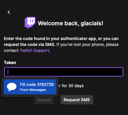
⚠ Gmail → iCloud Mail
The big one. I’ve been wanting to switch my email to a domain I control anyway, and iCloud+ supports that.
Migrating Emails
I don’t recommend importing Gmail archives into iCloud Mail; the experience was fraught with landmines and didn’t achieve the desired result. After starting from scratch several times and hitting new issues every time, I’ve chosen to live the life of searching in two places when I need something.
Migrating Email Addresses
To migrate email addresses I made a very tough decision that I'm still frustrated years later that I had to make, which was to change Google accounts. This is because I want my Google account's primary email address to be the one I give to people, as small usability quirks abound when it isn't.
For example, I give you my email address, [email protected]. You invite that email address to a meeting on Google Calendar with an attached Meet meeting. When I accept, it accepts from my Google account, not from the invited email address, so you see an unknown person added to the meeting, while I appear to have not responded. When it's time for the meeting, I attempt to join the Meet but get thrown into a waiting room because my Google account wasn't invited by you. Even worse, if you don't show up but the meeting should still happen (let's say a team meeting), I have no way to join. Google Groups experiences similar problems.
I tried to use a twos.dev Google Workspace account as my primary Google account first but many Google features don't support Workspace accounts, like Google One, family sharing, some security features, and (for better and worse) some types of data harvesting and therefore ad/search targeting.
So I'm left to creating a new personal Google account with [email protected] as its primary email address.
Signing up to Google without an @gmail.com address is a somewhat hidden option,
but it exists.
You just can't ever fall into the "upgrade" funnel that assigns you an @gmail.com address, because that can never be undone.
And of course, this means you can never use Gmail.
None of this would be so frustrating if there weren't so many things tied to my Google account, like Maps reviews, decades of chat history, and purchased content. I desperately wanted to keep my account, but there's just no way around all the little hiccups. For a brain like mine that can't handle those, things are as "walled garden" as you'd expect from an Apple product.
Daily Use
The iCloud web interface is bad. On my Windows gaming computer I’ve installed Thunderbird to get by.
Mail itself integrates very well with the rest of the ecosystem and has a solid UX at its core, but is plagued paradoxically by usability issues:
Mail's junk filter sorts ~one legitimate email per week into the junk folder, even after months of correcting it.
When attaching large files Mail allows you to send them as iCloud Drive links instead (Google has this same behavior with Drive), but I've had recipients experience trouble downloading them.
Unsurprisingly, Gmail's search is an order of magnitude better than Mail's. It's what I miss most. In Mail, what I'm searching for is often buried beneath piles of things I'm not. Clicking on results sometimes lands me in the right thread but on the wrong email. On macOS searches only happen in the mailbox being viewed (e.g. Inbox) and it takes an extra click to search everything, which is easy to forget. (iOS and iPadOS correctly search everything by default.) And when you are done searching and click Inbox to "return home" the search field doesn't clear, leading you to a seemingly empty Inbox.
Mail is below average at threading emails:
- Once in a while, it omits an email from a thread that it shouldn’t have.
- When replying to a thread, the sent email doesn't appear immediately in the local view, which makes it seem like something has gone wrong with the sending.
- When marking a thread as "Notify" (a nice feature which forces updates to the thread to send a push notification even when they're off), emails sent into the thread by you trigger the push. Even emails from the same platform and app that is in charge of notifying.
Mail has a high failure rate for autocollapsing quotes in email replies, causing some frustratingly long nested quotes in long threads. Gmail was always good at collapsing them automatically.
Mail is bad at converting text to rich text. For example, it will not automatically
convert markdown-esque lists (e.g. 1. Some text or - Some text) to rich text lists.
macOS Mail supports filters, but only locally. The iCloud Mail service has a separate filter system with the same effect, but the two have disparate feature sets and don't synchronize. iOS Mail does not support filters. I’ve opted to use Mail’s local-only filters because the iCloud filters can only check one condition per filter, and I just have my iMac stay awake 24/7.
macOS Mail has horrible keyboard shortcuts by default, e.g. ⌘^A to archive. Thankfully macOS natively supports rebinding shortcuts for any app.
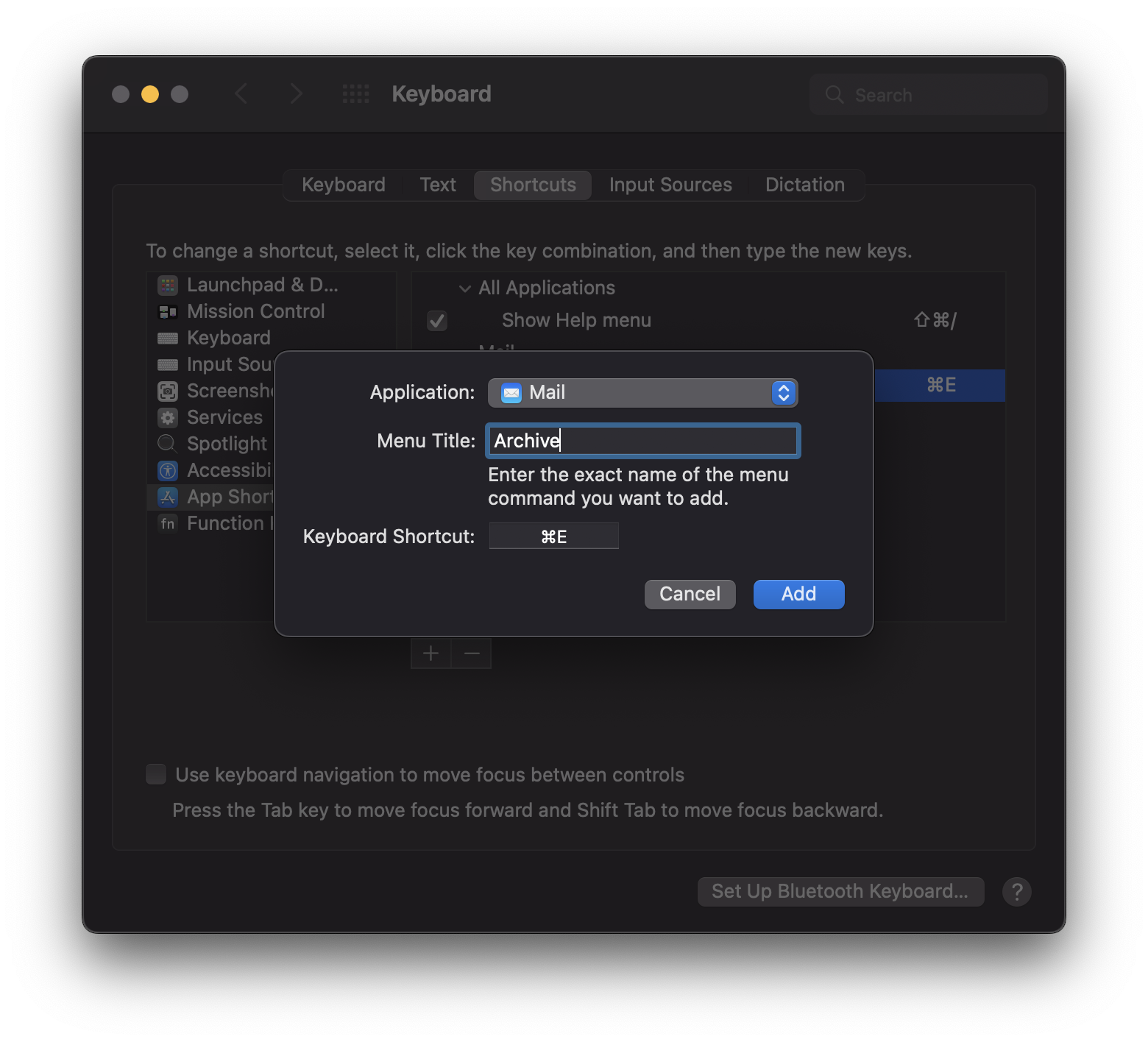
Any macOS app's menu actions (e.g. File → Save) can be [re]bound natively.
If you want a Mail-like experience with Gmail as a backend, instead of using SMTP I recommend Mimestream; it is written by a former Apple Mail engineer to have a similar UX but using proper Gmail APIs.
Ecosystem effects of Mail include having search results show up in Spotlight and behaving super well as a multitasking app on iPadOS.
⚠ Google Calendar → Apple Calendar
I switched to Apple Calendar as both an app and a calendar provider. I'd forgotten how limited and finicky calendar protocols are at their core. Many things just stop working when you leave Google Calendar. Folks send me invitations that don't show, my RSVPs don't make it back to them, and I sometimes don't receive updates to events. Even unfurling invited mailing lists into individuals (who can then RSVP individuallly) is specific to Google Calendar.
I switched my provider back to Google Calendar about 18 months in while continuing to use the Apple Calendar app. It's a much better experience while sacrificing virtually nothing in ecosystem benefits. I also get to avoid the crappy Apple Calendar web UI those few times I need my calendar on Windows, and I get the more powerful sharing / RSVP tools of Google Calendar.
As for the Apple Calendar iOS and macOS apps, I don't recommend using the Week view. Like Google Calendar, Apple Calendar uses a horizontal red bar to represent the current time of day; but this bar extends 100% of the width of the week, and does not do a good job showing you which day today is.
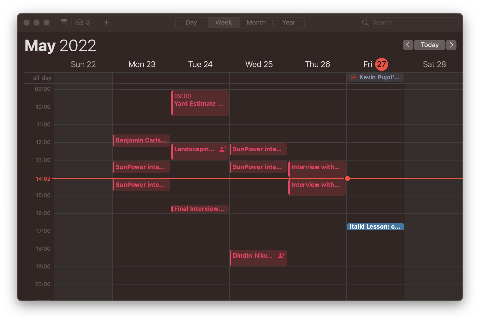
Week view in Apple Calendar. At a glance, can you tell what day it is?
This has led me to misread the current day multiple times, inducing panic about being late for meetings. I now use Day view, where the bar only shows when viewing today.
Mail has no special treatment of calendar invitations, which is to say they
appear as raw attachments. When Google Calendar users send a calendar invitation
there are two attachments, invite.ics and mime-attachment.ics. Each will pop
up a Calendar float to add the event. I don't know the difference; since
switching to Google Calendar as a backend I've learned to RSVP using the
embedded buttons which (outside of Gmail) open a web browser to the Google
Calendar UI.
Opening a Google Calendar invitation from within the Apple ecosystem.
Apple Calendar’s UI is prettier than Google Calendar’s, which hasn’t seemed to have a refresh in a decade. Apple Calendar can automatically generate “travel to” and “travel from” events based on the travel time between locations.
Ecosystem effects of Calendar include context-aware Maps, Siri suggestions for navigation destinations and video calls, and the ability to longpress dates and times in iMessage to create events.
⚠ Google Maps → Apple Maps
Apple Maps gets a lot of flak for its initial release state, rightly so. But that was years ago, and they’ve kept at it. It’s improved. Unfortunately it’s only gotten good, not great.
There are UX benefits over Google Maps, such as the spoken direction “Go past
this light, then at the next one, turn $DIRECTION”, but about 5% of my trips
to new places end me at the right area but wrong specific destination. I’ve been
routed to the delivery entrance for a museum, the back entrance for an airport,
and the wrong parking lot (15 minutes of walking wrong) for a store in a large
shopping center.
Then there's the other dimension of Google Maps: reviews, photos, menus, ordering, and reservations. Apple is a generation behind here; their purchase of Yelp means they inherit photos & reviews, but even that can't beat the sheer volume Google Maps. I've only seen one or two restaurants with ordering functionality enabled. Many business hours are out of date—I update them when I notice, but I'm just one person.
Ecosystem effects of Apple Maps include rich links in iMessage and Calendar, Siri suggestions for destinations based on those and other sources, and Apple Watch vibration patterns to indicate upcoming turns.
Departure
I’d like to continue to give Apple Maps chances because I know more data helps, but for tight schedules I wouldn't chance it.
✔ Location Sharing → Find My
I use persistent location sharing with a small set of close friends and family. The Google offering (built into Google Maps) and the Apple offering (a separate Find My app) are similar; anyone happy with one would be happy with the other.
I can see why Apple decided to contain the feature in an app you must launch with intention, but it's a wash for me. I've had several serendipitous encounters enabled by seeing a friend is close by in Google Maps accidentally.
AirTags and device tracking are the big killer features here, which work
as seamlessly as advertised. I threw one in my car and one in my bag just to
have peace of mind. The app sends a notification when I leave $DEVICE at
$LOCATION, with easy controls to disable future notifications for any such
combination.
✔ Google Photos → Apple Photos
Mostly, these two products are equivalent. Apple Photos has more powerful editing tools but Google Photos has more powerful search. Both have similar tooling around memories, viewing photos on maps or by year, etc.
Classically, Google has a better web experience and Apple has a better native experience, meaning sharing photos with others is better in Apple Photos if and only if you're sharing with other Apple users.
As I've been getting more into photography I've come to like how smooth the import experience is in macOS—insert SD card, Photos.app automatically opens up to the Import window, I tick "Automatically delete photos after import" and tell it go, and it's done. I can take the SD card out and the photos will upload in the background. The Google equivalent isn't hard but it takes more babysitting, either messing with the filesystem or leaving the SD card in for the entire duration of the upload (and in my case, forgetting to retrieve it later).
The migration from Google Photos to Apple Photos was simple, but long. Google Takeout produced hundreds of gigabytes of exports, which I downloaded onto a Mac and then imported with Photos.app. Due to Apple's offline-first approach synchronization tried to take place while the laptop was closed and charging. This was jarring at first when trying to babysit the process, as by design it stops performing well when you start using the machine. When I learned to let go, it showed its colors.
Ecosystem effects include rich support for embeds & commenting in iMessage, and photos appearing in upload prompts on all platforms (e.g. when uploading an avatar to some random internet account) with full face search embedded.
⚠ Chrome → Safari
This was a far less noticeable change than I expected. Everything from bookmark sync to my extensions to rendering works the same.
In macOS the Safari chrome fades into the background better than the Chrome chrome, such that websites feel a bit closer to standalone applications even when in a tabbed window. The touch gesture to go backward or forward slides the page on/off screen allowing you to peek without navigating, but it backfires and feels artificial for low-travel anchor links and some single-page app transitions. It also sometimes reveals a blank page until the navigation event triggers (when the gesture ends) for reasons I can't identify.
When it works it's beautiful and useful, but when it doesn't it's jarring.
Navigating through history in Safari with swipe gestures.
I tend to switch back to Chrome for Meet meetings, as I’ve experienced some local-only webcam freezing in Safari of myself or others. Meet also supports more types of screen sharing in Chrome, like sharing one tab.
Ecosystem effects of Safari include Handoff (move a browsing session between devices smoothly) and the downright bonkers power efficiency of Safari on macOS.
✔ iCloud Keychain
When I initially moved to Safari, iCloud Keychain was not powerful enough to replace my use of 1Password. It did not support multiple domain names per website, arbitrary text notes, or custom names for entries.
As of 2023 September, these problems seem solved. There are stil some shortfalls, but Simon Støvring's post helped shore them up; I've used his locked-notes strategy for non-password things I previously kept in 1Password, and all is well so far.
However, there are still some small downsides:
- Passwords are accessed from within the Preferences pane of Safari, macOS, or iOS.
- The difficulty of accessing them can be completely solved using this Shortcut, but it can be awkward to refresh authentication with e.g. an Exchange account, as you cannot have two System Settings windows open at once.
- Domain names for passwords are not directly editable, possibly for security reasons. To assign one password to multiple domains, you have to use the same credentials for another website and depend on it to invisibly merge them behind the scenes, which it often does, but in a way that's hard to diagnose if it doesn't.
- There's no "Archive" feature, so I have to decide if passwords I probably won't need again should be front-and-center or deleted forever.
- Windows support for Chrome exists via an extension that talks to the local iCloud background application, but requires typing a verification code every reboot and sometimes doesn't autofill quickly or at all.
I'm hoping these get fixed, but for now I'm happy enough working around them for the benefits.
Ecosystem effects of iCloud Keychain include faster and more fluid autofill support in Safari, on both macOS and iOS; automatic iCloud synchronization, and easily setup of password groups.
✔ Google Sheets → Numbers
To a casual user like me, Sheets and Numbers are ~identical. Numbers has a slightly nicer UX for editing formulae and tries to humanize references, e.g. “Ben age” for a cell in a row with header “Ben” and a column with header “Age”, instead of A:123. This is nice until headers get long and multiworded, and you use them in long formulae. Overall it’s a wash.
Google Sheets has a network effect going for it, so I still use it whenever I need to share a sheet with someone not on an Apple platform.
Ecosystem effects of Numbers include Spotlight integration for quickly opening a sheet.
✔ Keep → Apple Notes
I value simplicity and elasticity in notetaking—get out of my way and let me write. Let me deal with organization later. Keep gives me that. Its layout is hard to browse and hasn't aged well visually, but it makes up for it with great search.
Apple Notes is simple and elastic in a different way. Where Keep focuses on shortform sticky-style notes, Notes focuses on longform notes with rich text support like headers, tables, monospaced text, etc.
So where Keep is best used as a searchable cloud or swarm of notes, Notes is best used as a curated and categorized filing cabinet. One note in Notes might be several dozen in Keep, so the effort spent on curation is not so large, and neither is the impact of only-okay search.
After moving to Notes.app I jumped around to Org-mode, Bear, and Obsidian, but ultimately landed up back in Notes. I only wish there were a non-hacky way to export from it, but I landed back in Notes despite that absence, not because of it. (I started jumping around specifically because of it.)
Ecosystem effects of Notes include Shortcuts, one-click "upgrade" to a Pages document, a collaboration UX that spans Messages, Mail, AirDrop, and Reminders, cross-app drag-and-drop, and "quick notes" which use OS-wide gestures to capture ideas into a staging area quickly à la Org Capture.
✔ Tasks → Reminders
Reminders is one of the best-designed apps on iOS. It is simple and powerful.
Reminders can be scheduled to “pop” (send a push notification and become "due") at:
- A due date
- A due date and time
- When arriving at a location
- When leaving a location
- When getting in a car
- When leaving a car
- When messaging
$PERSON
Reminders can belong to lists (e.g. work vs. personal). Lists can have sections (e.g. pack bedroom items vs. pack kitchen items). Lists can be shared, and reminders within shared lists can be assigned to people.
Reminders can have priorities, notes, URLs, tags, and subtasks. Reminders can have images attached to them. Reminders can repeat on schedules.
Reminders are synchronized between devices, even Macs, so popped reminders show up where you are.
For example, Summer and I share a family reminders list. On that list is a single reminder that repeats every trash day, and pops when I arrive home. It’s assigned to me, so it only pops for me. But if Summer takes out the trash before I get home, the reminder doesn't pop.
Ecosystem effects of Reminders include integration with the share sheet in native apps (e.g. sharing from Safari automatically fills in the URL field) and the ability to persistently show a popped reminder (if any) on my Apple Watch homescreen.
ⅹ Google Assistant → Siri
Siri is nearly strictly worse than Google Assistant. It can't answer questions like "What temperature do I need to cook chicken to?" or "Who played Alan in Tron Legacy?". Its best uses are for deep integrations like setting reminders or alarms.
Ecosystem effects of Siri include interaction with native apps: setting reminders, playing music, controlling Home devices, etc.
✔ Google Assistant Routines → Shortcuts
I can’t say enough good things about Shortcuts. It is the most power-user-friendly thing about iOS and goes against all expectations I had around Apple and power users. For life automation, I prefer it to shell scripts.
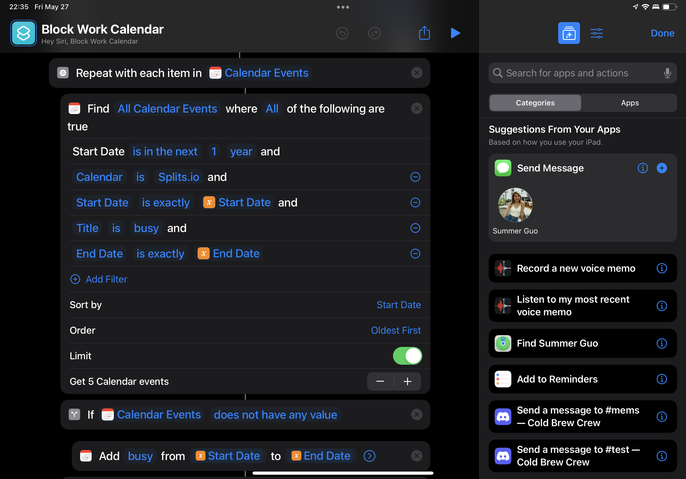
I use Shortcuts.app to block times on my work calendar based on personal events.
As one example, when I wrote in the iA Writer mobile app I would use Shortcuts to automatically commit and push my writing to twos.dev daily. Because iA Writer stores files in iCloud, and another iOS app called Working Copy can interact with Git repositories, Shortcuts lets me glue them together:
- (Working Copy) Pull from
twos.devremote - (iOS) Get contents of folder
iCloud/iA Writer/Published - (Working Copy) Write contents of folder to
./src/warmintwos.dev - (Working Copy) Stage
./src/warmintwos.dev - (Working Copy) Commit
twos.devwith message “Automatic commit by iA Writer sync job” - (Working Copy) Push
twos.devto remote
I’m a software engineer and am comfortable coding, but the fact that I could do all this without any was impressive. It’s also fun to say that my phone is a vital part of my CI/CD pipeline.
⚠ Google Drive → iCloud Drive
Most Dropbox-esque apps are the same and iCloud Drive is no exception. Use it if you're in the Apple ecosystem, and don't if you're not. The biggest downside I've witnessed is that iCloud Drive does not have an API. This is not a problem when running software on a persistent macOS or Windows machine, but for Linux or for ephemeral machines (e.g. CI) the only option is an unofficial reverse-engineered solution. This may be the reason I ultimately switch to something else. I have been trying out Syncthing.
Ecosystem effects of iCloud Drive include a more native sharing flow between your drive and apps (in both directions) and a tendancy for first-party and some third-party apps to use it as a default data store anyway (e.g. Pages saves documents there, Numbers saves spreadsheets there).
macOS also pulls a trick where it invisibly queues up actions on iCloud Drive files that haven't yet fully synced to your machine yet. For example, if you are on your iPhone and place an image in iCloud Drive, then open a Mac, the image will show up ~immediately in macOS Finder, before it has finished syncing. If you try to open the file in macOS before it finishes, the open action will queue until the sync finishes, then execute. This behavior is nice compared to the industry standard of trying to open a broken file, but when you first encounter it with a large file like a video it's easy to perceive it as OS-level slowness or stalling.
ⅹ YouTube Music → Apple Music
Apple Music is a great example of the big place Apple still struggles: services.
Importing my music was a headache and missed or incorrectly identified a lot of songs. The most reliable method I had involved an Automator workflow that would move the cursor to my existing library, select and copy a title, then move it to Apple Music’s search field, paste, and add the top result.
The UI of Apple Music for macOS is a let-down and is more on par with the iCloud Mail web interface than with any other native Apple app. Navigation is slow and unresponsive, which is compounded by the fact that it takes too many transitions to get where you’re going. For details on its UX failings, see Jake from Cinnamon's post.
Ecosystem effects of Apple Music include tighter Shazam integration, Spotlight integration, and better Siri support for playing things handsfree.
Departure
I miss Google Play Music, which solved all my problems. I've softly switched to Spotify which seems overall better, almost strictly so if it weren't for ecosystem effects.
✔ Google Pay → Apple Pay
I always felt that Google Pay was finicky, and that made me embarrassed to use it. It was hard to find "the spot" on credit card machines to tap. Apple Pay feels more spatially generous; once I start hunting for the spot, it's already been found. It could be because the iPhone NFC chip is located at the top of the device while Pixels have them in the middle, or maybe the world has just gotten better at this since then. I'm now using Apple Pay every chance I get.
Of the purchases I make in Seattle, about 95% of shops and restaurants with counter pay support Apple Pay, and about 20% of table-service restaurants do. For online orders, roughly half of the non-Amazon orders I place support it.
The experience of managing an Apple Card in Wallet is also the first credit card experience that feels like it was made this century. The app is beautiful, snappy, and simple. The rewards (2% cashback on everything via Apple Pay, 1% on everything else) are good but beatable; several banks now have universal 2% cashback cards.
Drilling into Apple Card transactions using Wallet.
✔ Google Podcasts → Apple Podcasts
Google Podcasts and Apple Podcasts are very comparable. Google Podcasts has a bit plainer UI, but they're both good enough.
The biggest upside to Apple Podcasts is the better sorting and filtering of episodes on a podcast-specific basis. For example, I like Planet Money enough that I want to listen to every episode, so I have them play from oldest to newest; most other podcasts I don't care so much and have no hope of working through their backlogs, so I go newest to oldest. These all interleave correctly when I hit the podcast-agnostic "Play" button on the homescreen, so that the correct episodes of each podcast are played.
The biggest downside to Apple Podcasts has been stability. Roughly 1-5% of the time I go to play a podcast, the player gets stuck loading it forever.
Ecosystem effects of Apple Podcasts include tight Siri support.
Conclusion
This is a living document.
Its goal is to document whether the Apple ecosystem is bigger than the sum of its parts. It is. But the more interesting detail I’ve learned is that it’s the long tail of tiny ecosystem benefits that makes up most of that excess. Not the two or three things per product I’ve mentioned above, but the dozens that happen without me noticing that add up to make a more enjoyable experience.
I equate it to working in a clean space vs. a messy space. There are functional benefits to working in a clean space—it’s easier to find things, spilling a liquid is not as destructive, you breathe in less dust—but the bulk of the benefit is in the hard-to-describe ways the space feels better and motivates more.
For now, I’m overall happy with the Apple ecosystem and would not count it out from becoming my new preference. But, time will tell and I'll continue to document my journey here.